
NICKI MINAJ (RAP/HIP HOP/POP)- The font, colours, and imagery provides a retro/vintage feel to the album cover, which is a typical convention of her genre. She is wearing revealing clothing, and staring directly into the camera. This connotes sexual desire, arrogance, and confidence. She is pouting her lips in order to maintain a sexual star image. This is redundant of an artist of her genre, especially being female. I like the colour scheme. It is female-orientated which will therefore reach a female audience, however, when used in advertising, the colour scheme may not appeal to a male audience. Her male audience will be gained through the male gaze. The Parental Advisory sticker adds an element of anarchy to the album, which explains that the content is explicit and should not be played infront of young people, or those who are offended by taboo language and sexual content. The song I have chosen to use does not feature any taboo language or sexual content, thus meaning I will not have to add a Parental Advisory sticker to my album cover. Tracks that feature such explicit content are likely to have a smaller audience, as the content is offensive in some way or form. It would not be allowed to be played on the radio or on television music channels without editing the curse words out, thus tampering with the original track.

RIHANNA (RNB/POP)- This is the front cover from Rihanna's 'Talk That Talk' album. The imagery used is fairly redundant of her genre, judging from the simple denotations such as the fact that she is a young female, she is attractive, wearing very little clothing, and displaying some form of jewellery. These conventions of her genre connote wealth, beauty, sexual desire, and youth. She is blowing cigarette smoke from her mouth, this connotes rebellion, and fits in with the image she is portraying of herself. I may use this as inspiration for the main character in my video, as it creates an edgy side to a redundant pop/rnb video. The font is simple, and relatively small. The camera angle is close-up, and her staring directly into the camera connotes arrogance and high self esteem. This is redundant of young female artists of this genre, and similar genres.

AZEALIA BANKS (RAP/HIP HOP)- The artist here is the focal point of the CD cover. She is portrayed in black and white, which contrasts to the salmon-pink and blue font and image-outline. This is also slightly redundant of her genre. This stands out, and would be good to incorporate into my own digipak. Azealia Banks' genre is not directly reflected here, causing her album cover to be depicted as entropic. The only elements of this front cover that reflect her genre are the font, her body language, and the price tags that are attached to her dress. She is staring directly into the camera, which connotes arrogance and self-confidence- this is redundant of her genre. The font used is informal, and incorrectly balanced, displaying slanted words and a scribble-type font. This also, is redundant of her genre. Her Asian-inspired attire and the images displayed are entropic, and challenge the typical conventions of her genre. The price-tags attached to her clothing connote wealth and power- typical aspects of her genre, adding redundancy. The production credits also fit into the colour scheme and style of the cover, adding informality and shows a lacking of professionalism, which is useful within this genre as it allows the audience to feel on a level with both the artist and production team.

BLACK GRAPE (ALTERNATIVE DANCE/BRITPOP)- Colour scheme. POP ART. I want to incorporate the colours. They're bright, vivid and will stand out when used in advertisement. The band name and album title are displayed in the artist's sunglasses. It is very modern, despite being created in 1995. The cover itself is fairly redundant to the genre, as Pop Art is used, and their genre is predominantly pop. The artist's clothing and hair cut is typical of the era the album was produced in, thus appearing very redundant. The font is modern and informal, and I hope to use a similar font to this for my own album cover. The sunglasses connote style and fashion, which may help the artist here to develop a star image, as he comes across as suave and stylish.

RITA ORA (POP/RnB)- This is very modern, very redundant of her genre, and appears to be fairly provocative, judging from her poses. She is wearing revealing clothing and jewellery which connotes money and sexual desire. I would like to use imagery like this on the CD digipak as it is relevant to my genre which is the same as Rita Ora's. The use of black and white is effective, and I am keen to incorporate this into my own design. The track list on the back of the CD case is red, and contrasts well with the black and white imagery. The record label and production credits written on the back of the CD case also match the colour scheme that is carried throughout the Digipak. I aim to use bright, bold colours when creating my digipak, but also wish to contrast them with black, white and grey, to produce a colour contrast that stands out.
Within my digipak I wish to feature copyright, thanks', a release date, an itunes link and all credits that are production related. I feel adding these creates a sense of professionalism, and will enable my digipak to look realistic, and feature similarly to the artists' digipaks that I have analysed above.

NICKI MINAJ PROMO POSTER- The colour scheme here is simplistic but effective. Nicki's pink wig is an element of her star persona. I wish to create a star persona for the main character in my video. She is staring directly into the camera, which connotes arrogance, and her posture is slightly slouched, however her pose emphasises her bust, connoting sexual desire. The title of this promo poster is black and white, which contrast to make it stand out. The font is plain, with the exception of the heading on the right hand side, which is in Italics. The camera lighting is bright, and shows Nicki's face and body in plain sight. Her tattoos are redundant of her genre (Rap/HipHop), and connote style. I would like to use a female main character in my video as the singer of the track I am to use is female.
FURTHER RESEARCH.
If the video does not work...
Nicki Minaj ft Cassie- The Boys
This video by Nicki Minaj is entropic. She is a Hip Hop rapper, however has chosen to create a video that is redundant of a pop video. I like the use of bright colours and shapes, and in particular, her attire. It is youthful and would attract a younger audience, predominantly female, however, she gains male audience through the use of Male Gaze. I wish to use the conventions of Pop genre from this video, in order to create a slightly entropic video, that doesn't follow a particular narrative.

RIHANNA- This is a magazine advert for Rihanna's album 'Rated R'. Again, a colour contrast has been used to stand out, using black and grey against a faded red. I am particularly interested in the fonts used here, as both Bold, Italics, and Regular fonts have been utilised on this one advert. The track titles that are being promoted are written in red, and the remainder of the text is in grey on a black background. This is a simple, yet clever technique to use, as the red font stands out the most on the advert, as is most likely to be read first by her audience. There is also a Parental Advisory sticker displayed left-centre of this magazine advert, which immediately implies that early-teens and children are ruled out of the target audience. This limits the audience and popularity the artist will gain.
logistics-
An RnB/Pop artist is likely to be able to afford a full-page advert in a magazine to promote their music. Rihanna is of the same music genre that I will be using, as has successfully used a full page advert. Rihanna is currently in the music charts, and is releasing new material regularly. This is ensuring that she stays popular, and does not fade from the public eye. The magazine would be read by teens, late teens, and predominantly women aged between late teen-35+.

JESSIE J (Pop/RnB)- This magazine ad also uses a simple colour scheme, thus being Gold, white and black. The image is in colour, and features Jessie J posing, directly addressing the camera. She is interacting with the audience through her gaze, and the contrast of colours will attract the audience as they're eye catching. This is clearly a full-page advert, and located in the centre of the page is Jessie's motif/logo. The gold, swirled lettering is used to help create a star image for Jessie, as it is now a brand used on clothing and stationary in a varied assortment of colours. I would like to create a star persona for the main character in my music video, and creating a font/logo using inspiration from Jessie J's will allow for a more realistic and creative style. This is important because style is perhaps the most significant convention of my chosen genre; pop/rnb. The shot has been taken against a white screen, and the lighting is bright. I wish to use bright lighting for my shoot to use on the cover of my digipak. I feel this would add simplicity to the cover, enabling me to use a bright colour scheme for the fonts and props within the shoot. Jessie's advert is perfectly suitable for her target audience, being both males and females, of varied ages (usually aged between 10-35+).
I aim to replicate Jessie's ad, and take the most inspiration from it, incorporating such ideas as 2 track titles created in different font size, and bold. Also, I would like to attach an artifical email address to which my target audience can use to contact management, and browse my artist's official website. I am also considering creating a management/production logo to attach to the bottom left and right of the page- like Jessie has done, in order to portray professionalism and create a more realistic advertisement.
logistics-
Like Rihanna, Jessie J is more than likely able to afford a full-page advertisement in a magazine. Similarly to Rihanna, Jessie J is also currently in the charts and produces music regularly. I believe the genre I have chosen is suitable for the largest target audience, thus able to gain popularity fast and therefore generate enough money to spend on advertisement. Creating a star persona for my main character in my music video will act as a commodity, which inevitably encourages sales and increases the artist and the artist's music's popularity. Artists such as Rita Ora, Rihanna, and Nicki Minaj have ultimately become commodities and and considered to be 'brands' as they have such a wide target audience, receive alot of radio-airplay and feature daily on television music channels such as MTV. The influence they have on their target audience is dramatic, and this is an aspect I wish to reproduce within my own video.

The image (centre) is of Mariah posing, looking directly into the camera. The lighting is bright here, much like the lighting in Jessie J's advertisement. She is wearing simple attire- a pale pink blouse which is slightly unbuttoned. This represents a sexual element, and the fragmentation of her cleavage is viewed through the male gaze. Although the majority of Mariah Carey's audience is most likely to be female, many males would be attracted to her too, but perhaps not for her music. Portraying herself sexually in this image allows her to be a commodity, and will naturally increase her popularity amongst men.
logistics-
Mariah is a world-wide known superstar, producing music of the same genre for decades. She is extremely popular, and within the last few years of her career has produced some songs in the charts. She reaches a wide target audience, and is perfectly able to afford a full-page spread in a magazine. I believe that creating a star persona for the main character in my video will gain the same achievement as Mariah, and therefore aim to produce a full-page advertisement for my artist.
MOTIFS AND INSPIRATION.

NICKI MINAJ- 'Barbie' motif. This has now become a selling point, and something her target audience recognise her for wearing often. It encourages the sale of merchandise and provides a window in the market for a new brand associated with Nicki and her music.
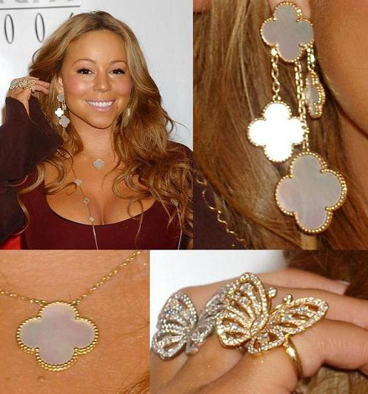
MARIAH CAREY- 'Butterfly' motif inspiration. This is redundant of her genre.

RIHANNA- 'Gun' motif inspiration which is tattooed on her ribcage. This rebels against the redundant aspects of the genre (pop/rnb). This motif is entropic to the genre, as guns are not associated with the upbeat nature of mainstream rnb/pop.
No comments:
Post a Comment