There are many props we require for our video.
# Costume- different outfits (max.3) for our model, most of which she will provide herself.
# A beanie hat/snapback cap- I have both already.
# Lipstick- I have a variety of lipsticks we are able to use.
# Make-up- We wont be using theatrical make up for example, just simple day-to-day make up which the model will already be wearing.
# Footwear- Either the model will be wearing appropriate footwear (pumps, trainers etc), or Kiah will lend her some for the shoot.
# Boxing Gloves- Kiah has a pair of boxing gloves that we can use for the shoot.
# Boxing Equipment- Providing we have full access to a boxing ring/gym, we will find all essential boxing equipment already there, with the exception of the boxing gloves and tracksuit which either me, Kiah or Thea will provide and have ready beforehand.
# Dog- One of our shots features our model walking a dog alongside a canal. Kiah has allowed us to use her dog for this shot.
Monday 24 December 2012
Cost of The Video
#With use of the college media equipment (cameras, tripods, green screens), we are able to create the music video without spending a lot of money, however, we are unsure whether the boxing ring we are hoping to use as a shoot location will require some cash in exchange for their provision of facilities. Kiah and I have discussed this, and as the location is essential to our shoot, we are willing to split the costs of boxing ring-rent equally.
#Driving to certain locations such as the canal in worcester will cost us only in petrol, and Kiah and I are both happy to drive when necessary.
#The cupcakes and icing we plan to use for our stop motion during the video will cost under £2, so again, we will equally split the overall costs.
#Driving to certain locations such as the canal in worcester will cost us only in petrol, and Kiah and I are both happy to drive when necessary.
#The cupcakes and icing we plan to use for our stop motion during the video will cost under £2, so again, we will equally split the overall costs.
Tuesday 18 December 2012
Choreography
We have discussed asking someone to create some dance choreography for our model. Bry is a college student and is able to create a short routine for our model.
Rihanna's Rudeboy video features choreography that we are keen to take inspiration from.
Also, Missy Elliott and Ciara's video '1,2 step' features dance moves that would look good in our music video. Although this genre is typically hip hop, the dance moves are relevant to our music genre; contemporary rnb/pop, as they have an urban edge.
Animatic
On Friday 14th December, we began creating drawings for the animatic. As of today, we have thus far taken 9 photos ready for editing. We have nearly completed all animatic drawings and will have uploaded all pictures and finished editing by Thursday 20th December.
Tuesday 18th December- We finished the drawings, and took photographs of the animatic shots. The total amount of footage is 57 seconds. This includes 2 verses and the chorus. We aim to upload and edit the remaining photos tomorrow, Wednesday 19th December.
This is the final product of our animatic. The total length of the animatic is 1 minute and 11 seconds, 14 seconds longer than we orignally planned. It was uploaded on Thursday 20th December- as planned.
There is a specific motif carried through our animatic, and soon to be carried through our video. We aim to focus on the mouth of the model, in particular, her lips. We plan to use different colour lipsticks to draw attention to the mouth, thus creating a star persona for our model. It is something she will be recognised for, and the audience will see that we have used this technique on purpose.
Wednesday 12 December 2012
Planning: Location
12/12/12
We require a boxing ring as the location of our music video.
I contacted a Boxing Gym in Worcester regarding filming access to their indoor boxing ring.
The manager requested that we ring again closer to the time to discuss this, after the Christmas period.
Box Fitness Worcester: 01905 611 399
I contacted another Boxing Venue called Worcester City Amateur Boxing Club.
07764 166279
There are a few other locations that we require for filming. They are easy to access and do not require permission, however a Health and Safety check will be mandatory to ensure there will be no damage to ourselves or the equipment we need for filming.
LOCATIONS:
# Boxing Ring.
# Spetchley Woods near college grounds- a brick wall covered in graffiti set behind a fence.
# Canalside, Worcester City.
# Bridge near Canalside, Worcester City.
# Classroom with a Green Screen (Our media room).
Planning: Storyboard
12/12/12.
Kiah and I have discussed the rough draft of the storyboard we have created. We have decided to mix entropy and redundancy, in regards to a narrative.
#The model in our video will be a female boxer, miming the lyrics at certain stages of the song, looking directly at the camera, with some choreography in scenes.
# She will have 2/3 different costume changes.
# The narrative behind the video will feature boxing and running (providing we have access to a boxing ring).
# We will use synaesthesia during some verses and the chorus to fit the beat of the song.
Tuesday 11 December 2012
Planning- Discussion
11th December- Kiah and I discussed the concept of our music video, and began creating a storyboard to choose which kind of shots we would like to use for it. We discussed the following:
# Model- previously discussed. We are using Thea.
# Costume- we decided on bright clothing.
# Props- Boxing gloves, dog, cupcakes.
# Locations- Canal side, possibly a boxing ring, Spetchley woods, inside media classroom.
We discussed the idea of using stop motion within our video. 'Born to Fly' is the title of track we are using, and as the chorus begins, we are toying with the idea of using cupcakes with icing and single lettering of 'Born To Fly'. We have practised using stop motion before, and feel it would be a beneficial technique for our video.

This is a stop motion video of cupcakes being made and iced. From 1 minute 49- I want to copy this action, but add lettering to the icing with the use of stop motion, from start to finish.
MOTIF- we have discussed using a motif, something the model can be recognised for. This will be created through Extreme Close Up shots (ECU's) of her mouth whilst she lipsings to some words of the song. These shots will be short, probably lasting no longer than 3 seconds (maximum), and we will change her lipstick/lipgloss accordingly to her outfit, ensuring she maintains a redundant contemporary rnb/pop singer-style.
CHOREOGRAPHY- we have briefly discussed choreography, and have contacted a friend of Kiah's to help with the creation of a short dance routine.
# Model- previously discussed. We are using Thea.
# Costume- we decided on bright clothing.
# Props- Boxing gloves, dog, cupcakes.
# Locations- Canal side, possibly a boxing ring, Spetchley woods, inside media classroom.
We discussed the idea of using stop motion within our video. 'Born to Fly' is the title of track we are using, and as the chorus begins, we are toying with the idea of using cupcakes with icing and single lettering of 'Born To Fly'. We have practised using stop motion before, and feel it would be a beneficial technique for our video.

We intend to remove the icing from these cupcakes which can be purchased at Tesco, add our own icing individually, and take many shots to create Stop Motion technique. After each cupcake has been individually iced, we will use a black icing pen to spell out 'Born To Fly' over the cupcakes.
This is a stop motion video of cupcakes being made and iced. From 1 minute 49- I want to copy this action, but add lettering to the icing with the use of stop motion, from start to finish.
MOTIF- we have discussed using a motif, something the model can be recognised for. This will be created through Extreme Close Up shots (ECU's) of her mouth whilst she lipsings to some words of the song. These shots will be short, probably lasting no longer than 3 seconds (maximum), and we will change her lipstick/lipgloss accordingly to her outfit, ensuring she maintains a redundant contemporary rnb/pop singer-style.
CHOREOGRAPHY- we have briefly discussed choreography, and have contacted a friend of Kiah's to help with the creation of a short dance routine.
Planning
Costumes, Props, Models, Locations.
Shot lists, Storyboard, Animatic.
Focus Group, Audience Research.
Technical Practise.
Development of the concept.
Time Management.
20th DECEMBER DEADLINE.
Shot lists, Storyboard, Animatic.
Focus Group, Audience Research.
Technical Practise.
Development of the concept.
Time Management.
20th DECEMBER DEADLINE.
Monday 3 December 2012


Sunday 2 December 2012
Focus Group
- I created a focus group on facebook.
- I added friends who enjoy the music genre- Pop/Contemporary RnB.
- I uploaded pictures of fonts, and template colour schemes, asking the members to comment
on my choices, saying whether they feel they are suitable for the music genre.
- I explained the concept I was trying to achieve through my digipak and advertisement.
Here is a screen grab of the overview of my facebook group.

This screen grab features a comment from a member regarding the font I wished to use on both my digipak, and advertisement.

I took the positive feedback and proceeded with using the chosen font I found on the website www.dafont.com.
This screen grab shows my magazine template that I created. I asked for criticisms.

I was advised to change the black block along the bottom of the advertisement, as it isnt attractive to the members of my target audience. The colour scheme and photograph were enjoyed by the members, however I decided to somewhat change it in my final draft; sticking to the black and white imagery, but changing the font colour.
Saturday 1 December 2012
Rough Draft Digipak

This is a digipak template I have created. I took pictures from the internet, saved them, and edited them using Photoshop.

Tuesday 20 November 2012
Shooting
I have booked a camera, I have approached the model I am going to use, and shooting will begin today for my digipak and advertisement.
MODEL- Thea Taylor.
LOCATION- Nearby woodlands.
PROPS- Purple winter jumper, purple ring, cigarette.
MODEL- Thea Taylor.
LOCATION- Nearby woodlands.
PROPS- Purple winter jumper, purple ring, cigarette.
Monday 19 November 2012
Performers- Casting
When looking for possible performers in my video, I began asking my friends that met my specified criteria.
CRITERIA:
# FEMALE
# FASHION- CONSCIOUS
# WILLING TO PUT IN THE HOURS
# AVAILABLE
Sunday 18th November- I met my friend Becky and discussed the possibility of her being willing to star in my video. She agreed, and dependent on whether my partner feels she is suitable to fulfil the role, she will be available for shooting.

Becky has an urban fashion sense which fulfils some of my cast criteria. It is evident that she is female, and has agreed to make herself available for shoots. My partner and I have not yet decided as to whether we will use Becky in our video.

Wednesday 28th November- I asked Thea if she would be willing to participate in the making of my video and digipak production. Thea has agreed to be in both sections of my project, and has told me when she is available. I have decided to use Thea because she has a very urban look, and in particular, I thing her facial piercing (nose ring) is very redundant of the genre, and allows her to have the urban edge I wished to include. She is fashion conscious and willing to wear any costume I present to her.
Print Work- The Concept
In relation to my pitch, I intend to create a digipak that is bright, colourful and slightly entropic of a Contemporary RnB/Pop song. I intend to use a female performer to star on the cover of the digipak. At present, I am toying with different ideas for the performer's pose.
My thought process thus far:
# Female on the digipak-front.
# Bright colours, maybe some use of Pop Art.
# The performer looking directly into the camera, addressing the audience.
Here are some shots I intend to replicate:


My thought process thus far:
# Female on the digipak-front.
# Bright colours, maybe some use of Pop Art.
# The performer looking directly into the camera, addressing the audience.
Here are some shots I intend to replicate:

Tanya Lacey is the artist of the track I am using for my music video. This shot is fairly redundant of her genre, however the visibility of her tattoos and jewellery give the shot a more entropic, hip hop theme. I aim to utilise this technique in order to create a more entropic shot, featuring either tattoos, piercings or jewellery. This is not a cover of a digipak, but a shot taken during a standard photoshoot for the artist.
Rihanna is of the same genre as my artist's track, and here she is clutching a Vogue magazine and smoking a cigarette. This is entropic of her genre, and I aim to use this concept in my own video. Her eyes are shut, thus meaning that she is not addressing the audience.
The graffiti in the background of this shot represents an urban theme, and is an entropic element of the genre, and Rita's attire and lipstick is bright and is redundant. This shot features both entropic and redundant features, and this is something I aim to reproduce in my own front cover for my digipak. This shot is not featured within her digipak. The location she is in is similar to the location I wish to use for my video, and have mentioned in my pitch. I like the pose she is doing for the camera; blowing it a kiss, as if directly addressing her fans/audience.
After analysing these pictures, I have decided that I would like to use a location similar to Rita's (a street and graffiti-covered wall) to have as the background on the front of my digipak. The performer will stand infront of it posing.
With regards to the inner CD tray of my digipak, I have a clear idea of what I wish to do.
# I will use greyscale/black and white camera setting when taking the shot.
# I will use the performer displayed on the front of my digipak.
# I will use an extreme/close up of the performer.
I have researched some images that are similar to my idea.
RITA ORA- This is an extreme close up of Rita's face. This shot focuses mainly on her sunglasses, which portray the message 'Cross my heart, hope to die, stick a needle in my eye'. This is totally entropic of her genre, and a feature that I wish to use within my digipak. The redundancy within this shot is portrayed through the lipstick she is wearing, and the dyed-blonde hair she has. She is half-smiling at the camera. This image is very similar to the image I have in my mind of what my inner-cd tray will look like. It reinforces dominant ideology of a feminine girl who uses hair dye and make up. It can be perceived as connoting vanity, as it is such a close shot, which goes hand in hand with arrogance- something I originally wanted to portray in my video and digipak.
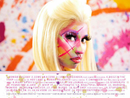
This is Nicki Minaj's tracklist. I aim to use bright colours like these, and a bright informal font for the tracks. I am still yet to decide whether I want to feature the female performer on my tracklist. In order to keep with the urban theme, I would like to use a location for the shot, not a photoshoot backdrop.
SOME IDEAS:
# Use a street wall for the shot, and add the tracks via photoshop, using a graffiti font.
# Contrast the colours of the dull background to the bright font.
# Display the tracks in note form.
This is Rita Ora's tracklist. I like the informal, hand-written font, and the colour scheme is simplistic. The lipstick stain and letter 'R' at the bottom right of the tracklist are motifs. In addition, the sunglasses at the top left of the tracklist are also symbolic of Rita's star persona, similar to the glasses featured in the shot I am using for inner CD tray inspiration.
This image of Rita Ora is taken from the inside-left of her digipak. All credits to producton and management etc are located at the bottom of the image, in a small plain font. Again, the colour scheme is predominantly black and grey, however the Record Label credit 'ROC NATION' is written in red font. This enables it to stand out against the greyscale background. I think using this technique in my own digipak will create a professional edge, drawing attention to the Record Label, connoting power and authority. I have been inspired to create a Record Label logo for my music video from this image.
Saturday 17 November 2012
Time Management
I created a TimeToast timeline on Thursday 22nd November.
Within this timeline, I created 'events' to discuss the pieces of work I had done, pieces of work I was in the process of completing, and pieces of work I was yet to begin. I carefully selected dates to begin pieces of work, knowing that I would fully be able to achieve.
http://www.timetoast.com/timelines/media-project-music-video-plan
http://www.timetoast.com/timelines/media-project-music-video-plan
Wednesday 14 November 2012
Target Audience
The target audience for my music genre (Contemporary RnB/Pop) are both male and female, with the age range varying from early teens to late twenties. The music is mainstream, able to gain radio air-time and access to the televised music channels such as MTV and 4Music. My audience are likely to rate from D to C1 on the Jicnars scale, as the type of music is of a hedonistic nature, aimed mainly at individuals at school, college, and university.
# They will enjoy partying, dancing and all aspects of socialising.
# They will have a very eclectic palate regarding music, but will enjoy the easy-listening popular music to set the tone for a night of partying.
# They will enjoy music from artists such as Rihanna, Rita Ora, Nicki Minaj and Jessie J, who's genre's are either identical, or very similar to mine.
# They will be very fashion-conscious, and enjoy spending time shopping for clothes that follow the current trends that are popular in society, and amongst their peer groups.
# The female audience will wear make-up and jewellery, however they will have an urban edge, allowing them to feel comfortable in any clothing, and not wear make up to an excess.
# The male audience will be smartly dressed, fashion-conscious and neatly groomed.
# Both female and male audience are likely to either have tattoos, or like tattoos, and the majority will have piercings or be open to the idea of piercings.

RITA ORA- Rita is a mainstream RnB/Pop artist with both an urban and quirky edge. Her tattoos create an urban sense, and the face she is pulling shows her quirky edge and laidback attitude to her appearance in this photoshoot.
Saturday 10 November 2012
Wednesday 7 November 2012
Initial Ideas
Here are a few initial ideas I had when deciding what kind of music video I wanted to create.
# Female performer
# Aged between late teens and early twenties
# Fashion Conscious
# Location- Boxing Ring, streets, shots infront of graffit walls
# Dance routines
# Use of Synaesthesia
# Close ups, extreme close ups, establishing shots
# Track, zoom, arcs
# Bright colours
# Outfit changes
# Female performer
# Aged between late teens and early twenties
# Fashion Conscious
# Location- Boxing Ring, streets, shots infront of graffit walls
# Dance routines
# Use of Synaesthesia
# Close ups, extreme close ups, establishing shots
# Track, zoom, arcs
# Bright colours
# Outfit changes
Tuesday 6 November 2012
Digipak and Advert Research
DIGIPAK RESEARCH.


If the video does not work...
Nicki Minaj ft Cassie- The Boys
This video by Nicki Minaj is entropic. She is a Hip Hop rapper, however has chosen to create a video that is redundant of a pop video. I like the use of bright colours and shapes, and in particular, her attire. It is youthful and would attract a younger audience, predominantly female, however, she gains male audience through the use of Male Gaze. I wish to use the conventions of Pop genre from this video, in order to create a slightly entropic video, that doesn't follow a particular narrative.


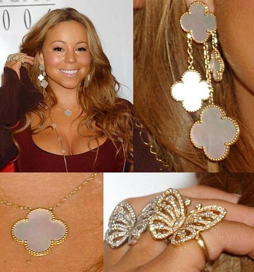
MARIAH CAREY (POP/CONTEMPORY RNB)- This magazine advertisement is not recent, and therefore lacks modernity. The fonts are simple, and in block red and black. The image is the centerpiece of the advertisement, as it features Mariah in colour, contrasting with a plain white background. What holds significance for me is the motif displayed that allows the audience to recognise her star persona; the butterfly. The small image on the bottom left of the page is her latest album cover. Again, the colours contrast with the white background allowing it to be more visible to her audience. Like Jessie J's ad, Mariah's name is positioned in the middle of the page. This is an immediate way of attracting her target audience. I aim to reproduce this is my own music video, and as mentioned previously; create a personal motif to produce a star persona for the main character of my video. A booking number is located at the bottom of the page. I intend to attach an artificial contact number to my magazine ad, claiming that it is a direct link to my artist's management team.
MOTIFS AND INSPIRATION.


NICKI MINAJ (RAP/HIP HOP/POP)- The font, colours, and imagery provides a retro/vintage feel to the album cover, which is a typical convention of her genre. She is wearing revealing clothing, and staring directly into the camera. This connotes sexual desire, arrogance, and confidence. She is pouting her lips in order to maintain a sexual star image. This is redundant of an artist of her genre, especially being female. I like the colour scheme. It is female-orientated which will therefore reach a female audience, however, when used in advertising, the colour scheme may not appeal to a male audience. Her male audience will be gained through the male gaze. The Parental Advisory sticker adds an element of anarchy to the album, which explains that the content is explicit and should not be played infront of young people, or those who are offended by taboo language and sexual content. The song I have chosen to use does not feature any taboo language or sexual content, thus meaning I will not have to add a Parental Advisory sticker to my album cover. Tracks that feature such explicit content are likely to have a smaller audience, as the content is offensive in some way or form. It would not be allowed to be played on the radio or on television music channels without editing the curse words out, thus tampering with the original track.

RIHANNA (RNB/POP)- This is the front cover from Rihanna's 'Talk That Talk' album. The imagery used is fairly redundant of her genre, judging from the simple denotations such as the fact that she is a young female, she is attractive, wearing very little clothing, and displaying some form of jewellery. These conventions of her genre connote wealth, beauty, sexual desire, and youth. She is blowing cigarette smoke from her mouth, this connotes rebellion, and fits in with the image she is portraying of herself. I may use this as inspiration for the main character in my video, as it creates an edgy side to a redundant pop/rnb video. The font is simple, and relatively small. The camera angle is close-up, and her staring directly into the camera connotes arrogance and high self esteem. This is redundant of young female artists of this genre, and similar genres.
AZEALIA BANKS (RAP/HIP HOP)- The artist here is the focal point of the CD cover. She is portrayed in black and white, which contrasts to the salmon-pink and blue font and image-outline. This is also slightly redundant of her genre. This stands out, and would be good to incorporate into my own digipak. Azealia Banks' genre is not directly reflected here, causing her album cover to be depicted as entropic. The only elements of this front cover that reflect her genre are the font, her body language, and the price tags that are attached to her dress. She is staring directly into the camera, which connotes arrogance and self-confidence- this is redundant of her genre. The font used is informal, and incorrectly balanced, displaying slanted words and a scribble-type font. This also, is redundant of her genre. Her Asian-inspired attire and the images displayed are entropic, and challenge the typical conventions of her genre. The price-tags attached to her clothing connote wealth and power- typical aspects of her genre, adding redundancy. The production credits also fit into the colour scheme and style of the cover, adding informality and shows a lacking of professionalism, which is useful within this genre as it allows the audience to feel on a level with both the artist and production team.
BLACK GRAPE (ALTERNATIVE DANCE/BRITPOP)- Colour scheme. POP ART. I want to incorporate the colours. They're bright, vivid and will stand out when used in advertisement. The band name and album title are displayed in the artist's sunglasses. It is very modern, despite being created in 1995. The cover itself is fairly redundant to the genre, as Pop Art is used, and their genre is predominantly pop. The artist's clothing and hair cut is typical of the era the album was produced in, thus appearing very redundant. The font is modern and informal, and I hope to use a similar font to this for my own album cover. The sunglasses connote style and fashion, which may help the artist here to develop a star image, as he comes across as suave and stylish.

RITA ORA (POP/RnB)- This is very modern, very redundant of her genre, and appears to be fairly provocative, judging from her poses. She is wearing revealing clothing and jewellery which connotes money and sexual desire. I would like to use imagery like this on the CD digipak as it is relevant to my genre which is the same as Rita Ora's. The use of black and white is effective, and I am keen to incorporate this into my own design. The track list on the back of the CD case is red, and contrasts well with the black and white imagery. The record label and production credits written on the back of the CD case also match the colour scheme that is carried throughout the Digipak. I aim to use bright, bold colours when creating my digipak, but also wish to contrast them with black, white and grey, to produce a colour contrast that stands out.
Within my digipak I wish to feature copyright, thanks', a release date, an itunes link and all credits that are production related. I feel adding these creates a sense of professionalism, and will enable my digipak to look realistic, and feature similarly to the artists' digipaks that I have analysed above.

NICKI MINAJ PROMO POSTER- The colour scheme here is simplistic but effective. Nicki's pink wig is an element of her star persona. I wish to create a star persona for the main character in my video. She is staring directly into the camera, which connotes arrogance, and her posture is slightly slouched, however her pose emphasises her bust, connoting sexual desire. The title of this promo poster is black and white, which contrast to make it stand out. The font is plain, with the exception of the heading on the right hand side, which is in Italics. The camera lighting is bright, and shows Nicki's face and body in plain sight. Her tattoos are redundant of her genre (Rap/HipHop), and connote style. I would like to use a female main character in my video as the singer of the track I am to use is female.
FURTHER RESEARCH.
If the video does not work...
Nicki Minaj ft Cassie- The Boys
This video by Nicki Minaj is entropic. She is a Hip Hop rapper, however has chosen to create a video that is redundant of a pop video. I like the use of bright colours and shapes, and in particular, her attire. It is youthful and would attract a younger audience, predominantly female, however, she gains male audience through the use of Male Gaze. I wish to use the conventions of Pop genre from this video, in order to create a slightly entropic video, that doesn't follow a particular narrative.

RIHANNA- This is a magazine advert for Rihanna's album 'Rated R'. Again, a colour contrast has been used to stand out, using black and grey against a faded red. I am particularly interested in the fonts used here, as both Bold, Italics, and Regular fonts have been utilised on this one advert. The track titles that are being promoted are written in red, and the remainder of the text is in grey on a black background. This is a simple, yet clever technique to use, as the red font stands out the most on the advert, as is most likely to be read first by her audience. There is also a Parental Advisory sticker displayed left-centre of this magazine advert, which immediately implies that early-teens and children are ruled out of the target audience. This limits the audience and popularity the artist will gain.
logistics-
An RnB/Pop artist is likely to be able to afford a full-page advert in a magazine to promote their music. Rihanna is of the same music genre that I will be using, as has successfully used a full page advert. Rihanna is currently in the music charts, and is releasing new material regularly. This is ensuring that she stays popular, and does not fade from the public eye. The magazine would be read by teens, late teens, and predominantly women aged between late teen-35+.
JESSIE J (Pop/RnB)- This magazine ad also uses a simple colour scheme, thus being Gold, white and black. The image is in colour, and features Jessie J posing, directly addressing the camera. She is interacting with the audience through her gaze, and the contrast of colours will attract the audience as they're eye catching. This is clearly a full-page advert, and located in the centre of the page is Jessie's motif/logo. The gold, swirled lettering is used to help create a star image for Jessie, as it is now a brand used on clothing and stationary in a varied assortment of colours. I would like to create a star persona for the main character in my music video, and creating a font/logo using inspiration from Jessie J's will allow for a more realistic and creative style. This is important because style is perhaps the most significant convention of my chosen genre; pop/rnb. The shot has been taken against a white screen, and the lighting is bright. I wish to use bright lighting for my shoot to use on the cover of my digipak. I feel this would add simplicity to the cover, enabling me to use a bright colour scheme for the fonts and props within the shoot. Jessie's advert is perfectly suitable for her target audience, being both males and females, of varied ages (usually aged between 10-35+).
I aim to replicate Jessie's ad, and take the most inspiration from it, incorporating such ideas as 2 track titles created in different font size, and bold. Also, I would like to attach an artifical email address to which my target audience can use to contact management, and browse my artist's official website. I am also considering creating a management/production logo to attach to the bottom left and right of the page- like Jessie has done, in order to portray professionalism and create a more realistic advertisement.
logistics-
Like Rihanna, Jessie J is more than likely able to afford a full-page advertisement in a magazine. Similarly to Rihanna, Jessie J is also currently in the charts and produces music regularly. I believe the genre I have chosen is suitable for the largest target audience, thus able to gain popularity fast and therefore generate enough money to spend on advertisement. Creating a star persona for my main character in my music video will act as a commodity, which inevitably encourages sales and increases the artist and the artist's music's popularity. Artists such as Rita Ora, Rihanna, and Nicki Minaj have ultimately become commodities and and considered to be 'brands' as they have such a wide target audience, receive alot of radio-airplay and feature daily on television music channels such as MTV. The influence they have on their target audience is dramatic, and this is an aspect I wish to reproduce within my own video.

The image (centre) is of Mariah posing, looking directly into the camera. The lighting is bright here, much like the lighting in Jessie J's advertisement. She is wearing simple attire- a pale pink blouse which is slightly unbuttoned. This represents a sexual element, and the fragmentation of her cleavage is viewed through the male gaze. Although the majority of Mariah Carey's audience is most likely to be female, many males would be attracted to her too, but perhaps not for her music. Portraying herself sexually in this image allows her to be a commodity, and will naturally increase her popularity amongst men.
logistics-
Mariah is a world-wide known superstar, producing music of the same genre for decades. She is extremely popular, and within the last few years of her career has produced some songs in the charts. She reaches a wide target audience, and is perfectly able to afford a full-page spread in a magazine. I believe that creating a star persona for the main character in my video will gain the same achievement as Mariah, and therefore aim to produce a full-page advertisement for my artist.
MOTIFS AND INSPIRATION.

NICKI MINAJ- 'Barbie' motif. This has now become a selling point, and something her target audience recognise her for wearing often. It encourages the sale of merchandise and provides a window in the market for a new brand associated with Nicki and her music.
MARIAH CAREY- 'Butterfly' motif inspiration. This is redundant of her genre.
RIHANNA- 'Gun' motif inspiration which is tattooed on her ribcage. This rebels against the redundant aspects of the genre (pop/rnb). This motif is entropic to the genre, as guns are not associated with the upbeat nature of mainstream rnb/pop.
Thursday 1 November 2012
Music Video Research
Music
Video Research
I have
chosen to use Shaggy ft RikRok’s music video for ‘It Wasn’t Me’ which falls
into the Reggae/RnB musical genre.
There are
many different camera shots used in this video. To begin, the video uses close
ups, extreme close-ups and reverse-shots to establish the relationship between
the two main characters- Shaggy and RikRok.
There is also the use of shots through screens- being Shaggy’s security
camera screen which features both characters during a conversation. Low angles
are used to point the camera up at the main characters, seemingly connoting
dominance and power. Transitions such as short takes, and cutting of editing
such as eyeline matches and cutaways are used to create a relationship between
the audience and the characters; maintaining their attention to the video.


Reverse- Shots: These
shots make it difficult to establish who the main character is, as they’re both
portrayed in the same way, thus connoting that they’re on a par with each
other.
There is an
establishing shot of the location which is Shaggy’s bachelor pad. It connotes
wealth and power, as it features a large mansion surrounded by an expensive car
and a long driveway.

The camera
movements within this video are fairly simple. It features Follow shot, where
the camera follows RikRok down the driveway toward the front door, Zoom, where
the camera focuses into the faces of the main characters, and more importantly-
the Zoom which fragments the females’ bodies within the video, adding
voyeuristic elements to the video, encouraging Mulvey’s theory of the Male
Gaze.

There is a
clear Arc camera movement which forms a semi-circle of camera time around the
two main characters. This connotes their power over the women in the video, and
focuses the attention of the audience onto the men. This also encourages people
to listen to the conversation they have during the song which explains the
story behind the video.

The
location of the video is set in a wealthy, sparsely populated area of America,
which features a Mansion, neatly trimmed hedges, and an expensive car on the
driveway. These features of Mise En Scene connote wealth and dominance over
economy.

The entirety
of the video represents wealth and power, as it also features other expensive
cars/motorbikes, GPS tracking machines, Mobile phones, champagne flutes and
cigars. This connotes bombast from the main characters, as stereotypically,
these visual features are perceived as ‘rich man’s toys’ by the average public.


The clothes
the main characters are wearing are bright- Shaggy is wearing a bright purple
jacket, and RikRok is wearing a red sweater. This connotes vivacity and
represents the characters as being animated and lively.


The women in
the video are wearing very revealing clothing. This fragmentation of the female
body encourages the audience to disrespect the women, and look at them through
a Male Gaze. This causes the women to be perceived as inferior to the men,
which also connotes that the men are pompous and clearly objectify the women,
changing their status in the video from characters to objects.


Here, Shaggy himself is using the Male Gaze, as he focuses
on the female’s bare legs.
The video
contains a variety of sexual elements throughout, and especially through the
use of props. For example- candles should represent romance and relaxation,
however here they are used to connote sexual activity, as the lust shared
between the male characters and the objectified women.


The GPS
tracking device Shaggy uses connotes control over the women. They are simply
pawns in his game. He uses it to track theirs and RikRok’s whereabouts in order
to warn RikRok of the trouble he is about to get into for cheating on his girlfriend.

The
alcohol and playing cards featured in the video represent a hedonistic
lifestyle.

This video
fits the stereotype of the genre; thus involving the theme of lust or love, and
clothing/props that represent wealth. This is typical of the RnB genre, which
tends to focus on materialism and female-fragmentation. This video has inspired
many other videos in a similar way. For example, in 2006, Sleepy Brown, Big Boi
and Pharell Williams created RnB song ‘Margarita’ which features visuals similar
to those featured within Shaggy’s video.

Here, this video features a wealthy location, and fragmented
female bodies- similarly to those featured In Shaggy’s ‘It Wasn’t Me’ video.
This is intertextuality.
Graham Allen
claimed that ‘In the Postmodern epoch, theorists often claim, it is not
possible any longer to speak of originality or the uniqueness of the artistic
object’. This claim is representative of the RnB genre, as ever since Shaggy’s
video (2000), other RnB artists are following the trend. Materialism is a clear
characteristic of the genre, RnB.
Due to the
video being mostly redundant to the genre, Andrew Goodwin’s theory of
Synaesthesia is applicable. It is possible to ‘see the sound’, as the majority
of the beats and cuts are in sync with one another, however this is not evident
throughout the video- it is mainly portrayed in the chorus. When the video
begins, there is Synaesthesia between the two main characters during their
conversation through the security camera. After this, there are a few times
where Synaesthesia is present.
This shot is shown when RikRok sings the lyrics ‘making love
on the bathroom floor’. It is illustrative of this event.
Just as RikRok says the line ‘I even had her in the shower’,
it features an illustrative event of him and a female having sex in a shower.

It becomes disjunctive however, toward the end of the video.
RikRok’s lyrics are, ‘I wanna tell her that im sorry for the things that i’ve
done…’ but his actions do not match his words, as he attempts to escape from
her on a motorbike and flee the scene.
Despite the
video and the lyrics clashing in meaning (sings about apologising for cheating,
but attempts to leave the scene when his girlfriend arrives to discuss with
him), the original connotations of the men being powerful and dominant diminish
toward the end, displaying a battle between gender, and eventually, the male
fleeing the scene, and the women winning the race in tracking him down. This
opposes the original idea of the male being ‘in charge’ and fragmenting and
objectifying women, and actually reverses to ensure that during the final few
moments of the video; the woman appear to be the dominant characters. However,
there is a final twist in the story, which enables the video to finish on an
equilibrium (the same way it started), with RikRok (the cheat) fleeing the
women and returning to the mansion that represents power, wealth, and dominance
over females.
The majority
of the video is redundant of the RnB genre, however towards the end of the
video, there is an entropic scene where RikRok jumps from a bridge and lands on
a lorry. This is disjunctive and entropic, as it contradicts the lyrics
mentioned previously, and confuses the audience.

Shaggy
and RikRok as artists have successfully developed a star image/persona as a
result of making this video. Shaggy’s pompous behaviour was originally
recognised in 1995 when he brought out the song ‘Mr Bombastic’. This enables
Shaggy to become a commodity. People buy into his image, as well as his music,
simply for what he stands for; thus again, in this video- promoting wealth,
dominance and power. This is redundant of Shaggy as an artist. The bright
colours he wears and the expensive props he features in his videos are
significant to Shaggy’s work, as he is materialistic and self-focused. He is
recognised for objectifying both women and money.

Shaggy- Mr Bombastic (1995)
Fragmentation of the
female body. Supports Mulvey’s Male Gaze theory. Shaggy is watching her, and
the audience are subjected to her exposed mid-section also.
There is an
unclear narrative structure within this video, however, there are elements of
Propp’s theory, regarding victims and villains. RikRok is a self-professed
villain within the video, as he has cheated on his girlfriend, who is now
considered to be the victim. However, as the video pans out, RikRok finds
himself victimised by a group of women who switch roles and play the villain,
who subsequently hunt RikRok down, and force him to flee the scene. This is a
pivotal moment within the video, as it reverses the stereotypical, redundant
roles that are predominantly evident in Shaggy’s music- thus meaning that the
women become dominant and powerful, leaving the men to act as victims. Shaggy
is likely to appear as the hero to men- as he attempts to help RikRok escape
the women, but will appear as the villain to women, for the very same reason.
This allows us to believe that Shaggy has more male fans than women, as he is
perceived as derogatory towards women.
Subscribe to:
Posts (Atom)